Designing an affordable, laser cut teleprompter
The long journey to create an inexpensive, large, diy teleprompter.

Prologue - Why does this exist?
The TLDR; - I am a stubborn mule who can't let good enough be good enough.
In September 2019, I had started seeing success almost accidentally from a instructional video series on my YouTube channel to help my dad get started with 3D printing. After editing a dozen videos filled with hours of my meandering and stilted stream-of-consciousness dialog, I had to find a better way.
I was immediately reminded of the 22 Rules (Guidelines) of Storytelling by Emma Coats. Number two and three particularly hit me hard:
- You gotta keep in mind what’s interesting to you as an audience, not what’s fun to do as a writer. They can be very different.
- Trying for theme is important, but you won’t see what the story is actually about 'til you’re at the end of it. Now rewrite.
It was so much easier to write out the script, scrap it, and redo than trying to do it all live on video. My challenge was how to read the script while keeping eye contact with the camera. Enter teleprompters. I naively assumed I could order one for $60-100 bucks - after all it's just a mirror on a stand, right?
Well in 2019, there was one affordable option from Parrot for $140 that could only hold a phone as the screen. There were several very janky products <$100 that I was scared to put a camera or tablet onto safely.
All of the professional options were $1500+ dollars, and the "prosumer" options were all $500+ dollars too.
So as with many of my projects, I thought, how hard could this be? I'd just unboxed the brand new Glowforge Pro, and it seemed like a perfect laser cutting project.
Why did this take 4 years?
I had a lot of learning to do. Why are the options on the market so expensive? Why aren't there many (or any in 2019) DIY options?
Along the way I encountered three sets of problems that affected one another and brought me back to the drawing board over and over again:
- I want to use this myself, so it has to be useful, usable, and desirable.
- Useful: I can record a scripted video in a single take, and the additional time of script writing, publishing, and playback is substantially less than editing multi-take footage.
- Usable: I can perform all my normal camera operations without any additional process due to the teleprompter - lens and camera changes, camera angle and position changes and basic storage and setup of the camera. I don't have to worry about breaking the teleprompter or camera, or tablet due to shoddy build quality.
- Desirable: It looks like a high quality addition to my studio - as it is the single piece of equipment I will actually be looking at most of the time.
- I want to make this suitable for other people to make, use, and enjoy
- Designed for manufacture - use only the material necessary, and be conscious of the time and resources of others.
- Designed for assembly and repair - provide assembly instructions and ideally make it fully reversible so others can improve, add-on, and fix any issues I will inevitably have missed.
- Designed for flexibility - finding a happy medium between product value, manufacturing, and assembly to enable to widest range of people to find the product valuable.
- I want to be able to sell the design in a reasonable form to recoup my time
- Find a way to make the final product available to keep it low total cost
- Hopefully make the whole project a net zero monetary investment
The Bermuda triangle of product development - manufacturability, flexibility, and assembly
For anyone who has ever made a commercial, physical product - flexibility, manufacture, and assembly are the the magic nightmares.
Flexibility

While I only needed to support a Panasonic GH4 originally, I quickly realized this wasn't going to cut it for others. And unfortunately, other than the 1/4-20 UNC underneath of most of these cameras, there is nothing standard about camera spacing, mounting, or sizes. So I was going to need some kind of flexible mounting system. This led me to research mounting standards:

I was shocked at how locked this information is. I had to pay $46 USD to get a 10 page PDF with 4 diagrams on it - for a single screw mount. And this was the
only standard I could even purchase. Everything else used in the industry is a manufacturer proprietary interface.
Fortunately several of the proprietary interfaces have been reverse engineered, but this was a nightmare. Ultimately, this was the reason I dropped consideration for anything beyond full frame camera bodies. It kept everything relatively simple.

The biggest reason I embarked on this project in the first place was in search of a bigger screen so I could more easily read text.
In the tablet space, 10" tablets are the sweet spot - with many like the FireHD 10 consistently available for under $75. Stepping up to a 12 or 13" tablet often carries a 5-10x cost increase.
As an interesting alternative, the proliferation of portable monitors, aka laptop displays with a cheap HDMI board started becoming both decent quality and cheap in 2022 or so.
The big advantage for tablets is brightness - with the FireHD 10 and most "name brand" 10-11 inch tablets reaching 400 nits and some as high as 500. The iPad Pros reach 600, with the newest models going to 1000+ nits. This means you can use a cheap piece of thin plastic as a mirror, instead of relying on beamsplitter glass.
The big advantage for monitors is size for price, as well as remote control. However almost every affordable portable monitor on the market is 200-250 nits, making beamsplitter glass an absolute requirement. Fortunately the cost of these glass panels have dropped by 70-80% during the years I worked on this design.

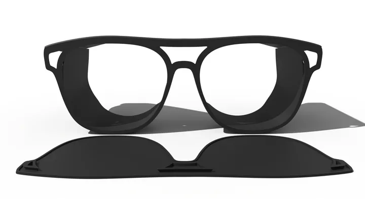
Yet another choice - how big should the beamsplitter panel be? Originally I thought I needed to go huge. But anything over 9x12 became a practical nightmare to manage in a studio setup.

I even had the good fortune to spend time on set with ABC television and see the teleprompters that the big boys use. I knew I could safely scale down.
So why 8x10 specifically? It is one of the few common sizes that overlaps between Acrylic/PET and beamsplitter glass panels (256x206mm). So I knew I could offer at this size so that buyers could buy a glass panel, cut their own, or buy a cheap 8x10 picture frame and use the PET sheet used as the "glass".
Assembly
Do you use screws, glues, or snaps?
I spent two years experimenting with joinery techniques for laser cut wood.
Credits to Clement Zheng https://clementzheng.info/Joinery
 MSRaynsford

These resources all helped me understand the tradeoffs and limitations of 2 axis machining, as well as specific limitations of wood, plastics and metals.
I spent a lot of the early iterations using Pettis joints:


As well as various Tee joints:

And corner box joints:

But I kept coming back to two problems - the first being that Pettis joints required long screws, and corner box joints needed glue. Screws are expensive relative to wood, and assembly becomes pretty tedious. And wood glue is, well, wood glue.
Then the aha moment came
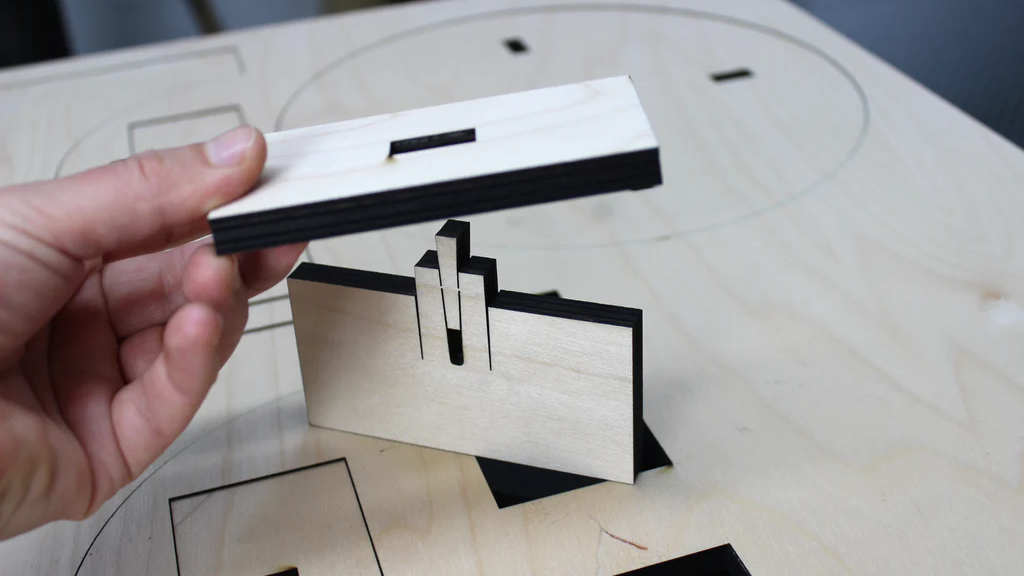
It was an accident while testing kerf calibration, but I found that with just the right tolerances, I could create Tee joints that were easy to insert, but extremely tight, almost snap-fit level of tolerance.


By utilizing the kerf on both the tab and pocket, initial insertion is very easy, especially for parts with multiple tabs/pockets to align. However, because the other side of the pocket is smaller than the diameter of the tab, doing it in reverse is difficult (though not impossible).
The kerf on the tab, when fully inserted acts to compress one side where it clears the material, and forms a micro notch on the other side where it sits below the pocket surface.
I tested this approach on dozens of prototypes, and these joints have stayed rock solid for multiple years. The downside to this approach is that it doesn't work well for corner joints, but that is a compromise I was able to design around in time.
Design for manufacture
Initially I didn't care much about this, if I needed a few boards of plywood, who cares, right?
But as the designs got more refined and started to look like something I might consider selling, I got really worried about the how to actually make this thing efficiently.
After cutting out the 20 or 30th prototype I started to realize just how much time was being spent cutting "duplicate paths"


You can see early toolpaths as most laser cut projects are laid out to the left. In the middle was an early "simple" overlapping experiment, and to the right is an example of an iteration with highly nested parts.
This approach came with two advantages and two disadvantages.
Advantages
- Actual cutting time on most of my early experiments was reduced 30-50%
- Far less burnout and flare ups due to avoiding closely overlapping cavities
Disadvantages
- Layout optimization had to be fully manual, taking a ton of time and experimentation. I have yet to find any packing algorithm that can do zero-overlap for laser manufacturing.
- Give and take with part design. Sometimes to fit in a cavity, or optimize the cut paths meant changing part geometry. This created a virtual infinite loop that at times was a pain in the butt to get everything aligned.
Both of these disadvantages could be solved in software, but I doubt there's enough of a market demand for it to be worthwhile to create such a solution.
The fortunate piece of layout optimization that saved me hundreds of hours of manual work was a single command in Rhino3D - Make2D. I could import my pre-kerfed toolpaths from my CAD software as a SVG or DXF, and in Rhino simply snap everything right on top of one another, select all, and Make2D.
This command perfectly removes all duplicated linework. Combining this with color coded layers in Rhino, I was able create and track multi-stage cuts with ease to ensure parts would be progressively cut out without risking small bits flying off the table or curling if the wood had a small warp in it.
This one command was worth the purchase of a Rhino license for me.
So that's pretty much it for research and methods, lets take a look at how all these concepts and processes came together in a series of design iterations that I am truly ashamed of.
Version 1 - The MVP
This was version 1 - modeled after some of the commercial metal designs I found researching online. Technically this design worked. In practice it was a giant pain in the ass to use. It needed two tripods, one for camera and one for teleprompter, the tablet had to be held level or it would slide off the shelf, and I had to paint all the wood black. It used a ton of wood, had a ton of parts and every part had to be glued together.
It worked, and I hated it.

Version 2 - Lighter, stronger, less material
So next up I wanted to tackle the big problems with V1 - too much material, too much glue, too many parts, too heavy, and too fragile. In the mean time I'd also discovered the world of camera rods - this seemed like a much better way to mount things than 1/4-20 tripod bolts.
This design never made it to a physical form. Turns out it is nearly impossible to make compound joints with a laser cutter - who knew? (Everyone except me apparently).
Despite some papers and experiments that have tried it https://www.lungpancheng.tw/publication/flaticulation/Flaticulation.pdf - in practice the joints are ugly, weak, and very fiddly.
But several concepts here survived far into future iterations - the basic box carriage, rod mounts and center entry lens cutout.

Version 4 - Scissor lift and accordion door


Version 4 was an attempt to keep the conceptual idea of using compound curves - but using paper instead of wood. This would mean less painting of wood, and less weight and material. It didn't work. Securing the paper used almost as much material as just using wood, and it was more parts and more complexity and ugly, and tedious to assemble.
This was also my first attempt to introduce a combined camera mounting mechanism, using a scissor lift and a thumbscrew to adjust the relative height of the camera. The scissor lift actually worked. I was really proud of this design. But it required screws, locknuts, nylon washers, and a TON of alignment to keep everything from binding. Turns out scissor lifts are made of metal for a reason 😄.
Versions 5 and 6 were vain attempts to get these concept to work in slightly different ways.
Version 7 - Infinite adjustability...


It was version 7 that introduced another design goal - adjustability. I had multiple cameras, a Canon Rebel T3i, a Canon camcorder, a Panasonic GH4 - and none of them had the same mounting location or dimension from mount to lens center.
Continuing with the rods, this was an attempt to make it easier to assemble and mount camera and teleprompter independently.
This design also "worked" - but again too many fiddly parts for the lens assembly and it only worked with a single size tablet.
Versions 8, 9, 10, 11, and 12 were all permutations of previous ideas - using paper for compound curves, rod mount for adjustability, replacing the rods with just wood sections, etc. They all sucked.
Version 14 - Sniffing success

Version 14 was the first introduction of adjustment for tablet mounting. It could accommodate 7" to 14" tablets, using thumb screws and a lot of nylon washers and locknuts. Still using rod mounts, but with a joined plate for tripod mounting. The method here for securing the rods was another element I was super pleased by - it looked pretty elegant and worked. In retrospect, keeping this single design element was mistake and cost me many months of bad iterations.
This was also the first iteration to use a single "wing" backplane. In CAD it was a beautiful solution, simplifying a bunch of joint and mounting problems. In the real world it was very wobbly. Even using 6mm plywood, the flex was unnerving.
It was with this design and the derivatives v15, v16, v17, v18, and v19 that I recognized this basic shape was a good basis, and that using different tablets easily was useful.
I used v14 for about 6 months - with a janky black cloth to cover the camera and back of the glass. I went back and forth between iPads, FireHD tablets, and portable monitors as the display - because teleprompter software was kind of crappy. The adjustability was really nice.
Other than the wobble and fiddly nature of this design, the deal killer was the fixed angle of the glass. I found myself constantly wanting to adjust the angle of the prompter to get a better view of the tablet. 45 degrees just never seemed quite right in the real world.
V20 - All the main ingredients are in the recipe


Looking like something usable
After 6 months, I came back to the drawing board. Fix the wobble, simplify tablet mounting, add back the camera mount but in a simple way.
This design also worked, and I used it and it's derivatives v21, v22, v23, v24, and v25 for another year. Everything for the first time felt solid and stable.
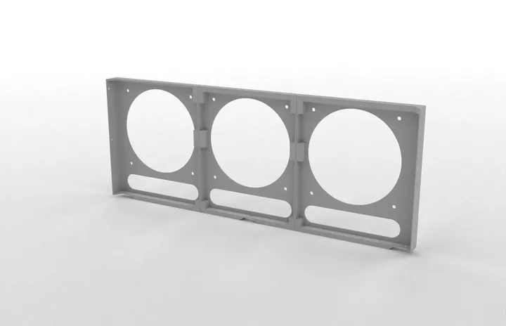
It was a still a LOT of parts, but for the first time everything fit on a single 12x20" sheet of plywood. This was the first design where I started nesting parts. I reduced the required hardware substantially, just using 1/4-20 nuts, bolts, and thumbscrews.

This was also the first design that felt like it might be good enough for other people to use. So for V24 I took a shot at assembly instructions baked onto the parts.
This didn't survive in later designs for several reasons, but the main one was the substantial added cut time on the laser. The idea worked really well though - numbered tabs go into same numbered holes, and in the order labeled.
But, after living a year with this design it still didn't feel like the final form.
Adjusting the height of the camera mount was really time consuming, and changing cameras even more so. I still had to glue together the whole frame and glue nuts into place.
It still used a lot of nuts and bolts, and tightening the tablet clamps was also fiddly and cramped. And it looked a bit like a wooden castle from the 18th century.
V26 - Final form


V26 landed on all of the final basic elements. I realized that I really loved fitting wood together, but the screws and nuts always felt a bit out of place and foreign during assembly. I also realized that for most folks, having to buy a half dozen screws is both expensive and time consuming - you either buy a giant assortment and have to store all this extra stuff, or you buy just what you need at the local hardware store and pay an arm and leg for it.
So this design had a few additional goals - use as little non-wood elements as possible, simplifying the camera and tablet mounts, and improving the aesthetics.
The main reason I kept iterating from this version came back to material usage - the large monolithic side panels took me back to needing two sheets of material with a lot of waste.
V29 - Oops I did it again

29 had the goal to get back to one sheet of material. I succeeded, but added 6 bolts and nuts and a lot of complexity in assembly. It sucked, and I kept moving along.
V31 B - Almost done


Finally in late 2022 I landed with 31B. This design introduced one magical element - no glue. With the optional and removeable camera mount, this design could be entirely snap fit together. It was secure, and really stiff for being a snap-fit assembly.
The cost was additional wooden parts. I used the voids from several tabs as joinery pegs to create really rugged mounting points for the tripod mount and camera mounting plate.
But in practice this was really fun to assemble and further reduced waste material. This design also brought everything back to a single sheet of plywood.
The only nagging issue with V31 was covering the camera. I ended up using a kids black tshirt and a makeshift drawstring that kind of sort of worked. It was still janky and fiddly, and prone to sliding off or getting bunched up.
I made several iterations of cloth patterns that would be more elegant, but unless you owned a sewing machine, you'd be in a world of pain trying to replicate the part. Going to back to my first principles, I knew this wasn't going to work - I needed materials that could be easily cut out on the laser cutter.
So I took another break. I came back again in late 2023, and drawing inspiration from V1 - thought, would this work with paper?
And so the final version finally landed - V32 Revision 40.

No glue required, no screws required (though optional and useful), and fully reversible assembly using commodity materials. I'm pretty proud of the result. It's definitely not perfect, but I think it achieves all the goals I set out to meet and looks pretty nice too. If you're interested in supporting me and making the project, have a look at the product page for it over here.